

The
Omnipotent
Arm
City of Nitra
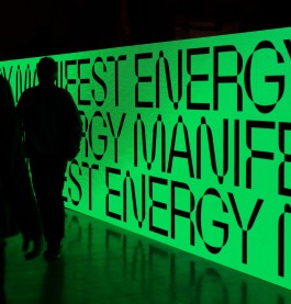
Creating a complex visual identity for a juggernaut of a client – the oldest and probably proudest city in Slovakia – was a high-wire act, balancing tradition and seriousness that it deserved with modern, somewhat playful approach.
Nitra, as the oldest Slovak city, has the advantage of a long tradition of visual design compared to other, younger cities. The city’s coat of arms, an armoured arm bent at the elbow, has been associated with the city since the 15th century. Its long tradition, symbolism and immutability have made it a significant element with which the inhabitants have lived for generations. It plays an important role in the locals’ identity as they have formed an emotional relationship with it, proud of their visual representation.
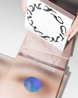
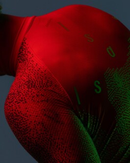
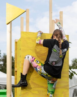
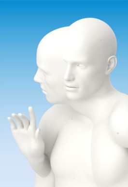
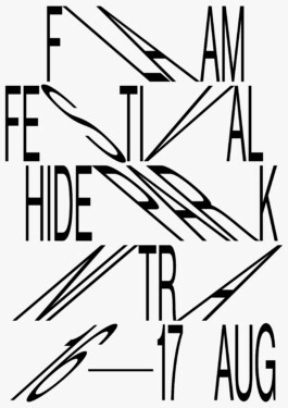
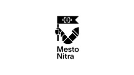
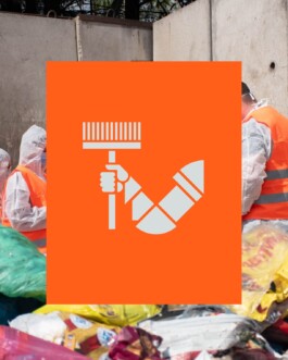
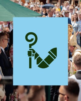
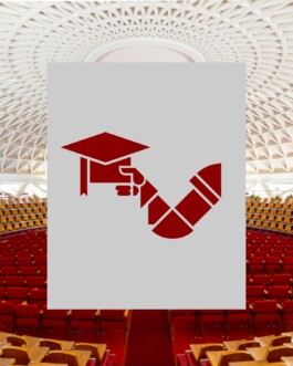
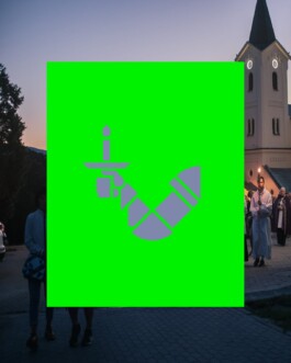
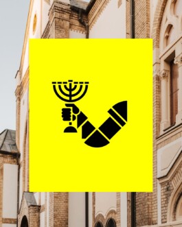
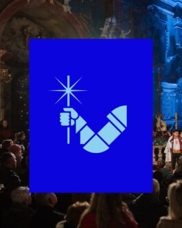
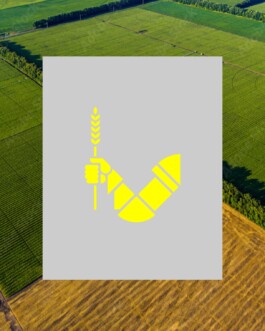
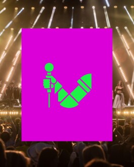
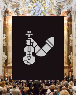
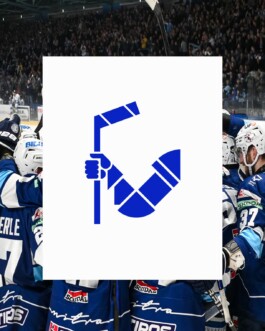
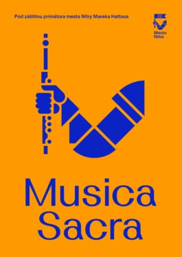
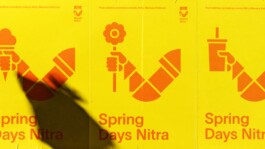
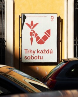
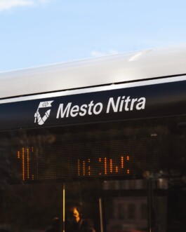
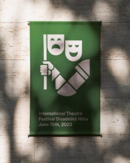
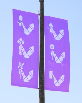
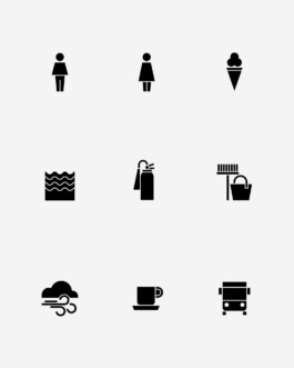
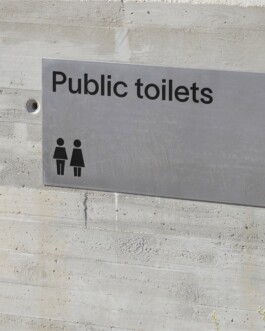
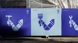
The visual identity of a city is an element representative of both the private (personal) and public (functional) domains of city life. The strategy in creating this identity was led by sensitivity to sentiment and historical context while at the same time paying close attention to the shifting and ever-changing needs for such a system. The coat of arms, an armoured arm bent at the elbow, was chosen as the main element of the new visual identity. Through the process of visual abstraction, the armoured arm was recreated as the city’s logo. The main aim was to create a connection between the coat of arms and the logo of the city of Nitra, not to create a duplicate logo and inconsistent or chaotic visual communication. The identity system uses the hand of the knight as a new medium that can carry a variety of symbols in countless mutations – e.g. for branding and unifying a number of institutions under the city's governance, communicating notices or seasonal affairs. Another element of the identity is the bespoke typeface Hlaholica Neue, inspired by the first Slavic Glagolitic script, based on the original shapes and strokes of the Glagolitic alphabet, which is historically strongly linked to Nitra.
Client: City of Nitra
Industry: Civic & Public
Type: Identity, Typography
Collaboration: Martin Kahan
Year: 2022


Coat of Arms
Coat of Arms
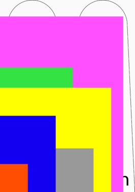
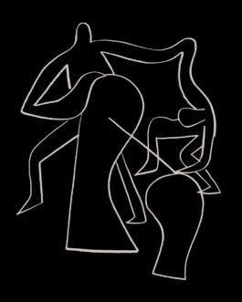
The coat of arms, an armoured arm bent at the elbow, was chosen as the main element of the new visual identity. Through the process of visual abstraction, the armoured arm was recreated as the city’s logo. The main aim was to create a connection between the coat of arms and the logo of the city of Nitra, not to create a duplicate logo and inconsistent or chaotic visual communication.


Poster
Poster
Poster
Poster
Poster
Poster


Hlaholica Neue
Hlaholica Neue
Hlaholica Neue
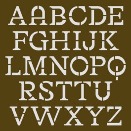
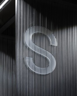
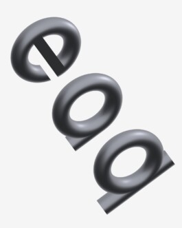
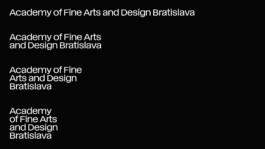
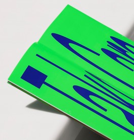
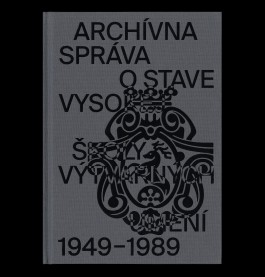
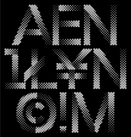
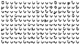
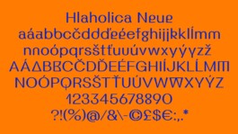
Another element of the identity is the bespoke typeface Hlaholica Neue, inspired by the first Slavic Glagolitic script, based on the original shapes and strokes of the Glagolitic alphabet, which is historically strongly linked to Nitra.


The Omnipotent Arm
City of Nitra
Creating a complex visual identity for a juggernaut of a client – the oldest and probably proudest city in Slovakia – was a high-wire act, balancing tradition and seriousness that it deserved with modern, somewhat playful approach.
Nitra, as the oldest Slovak city, has the advantage of a long tradition of visual design compared to other, younger cities. The city’s coat of arms, an armoured arm bent at the elbow, has been associated with the city since the 15th century. Its long tradition, symbolism and immutability have made it a significant element with which the inhabitants have lived for generations. It plays an important role in the locals’ identity as they have formed an emotional relationship with it, proud of their visual representation.
The visual identity of a city is an element representative of both the private (personal) and public (functional) domains of city life. The strategy in creating this identity was led by sensitivity to sentiment and historical context while at the same time paying close attention to the shifting and ever-changing needs for such a system. The coat of arms, an armoured arm bent at the elbow, was chosen as the main element of the new visual identity. Through the process of visual abstraction, the armoured arm was recreated as the city’s logo. The main aim was to create a connection between the coat of arms and the logo of the city of Nitra, not to create a duplicate logo and inconsistent or chaotic visual communication. The identity system uses the hand of the knight as a new medium that can carry a variety of symbols in countless mutations – e.g. for branding and unifying a number of institutions under the city's governance, communicating notices or seasonal affairs. Another element of the identity is the bespoke typeface Hlaholica Neue, inspired by the first Slavic Glagolitic script, based on the original shapes and strokes of the Glagolitic alphabet, which is historically strongly linked to Nitra.
Client: City of Nitra
Industry: Civic & Public
Type: Identity, Typography
Collaboration: Martin Kahan
Year: 2022


Coat of Arms
Coat of Arms
The coat of arms, an armoured arm bent at the elbow, was chosen as the main element of the new visual identity. Through the process of visual abstraction, the armoured arm was recreated as the city’s logo. The main aim was to create a connection between the coat of arms and the logo of the city of Nitra, not to create a duplicate logo and inconsistent or chaotic visual communication.


Poster
Poster
Poster
Poster
Poster
Poster


Hlaholica Neue
Hlaholica Neue
Hlaholica Neue
Another element of the identity is the bespoke typeface Hlaholica Neue, inspired by the first Slavic Glagolitic script, based on the original shapes and strokes of the Glagolitic alphabet, which is historically strongly linked to Nitra.


Enquiries:
info@andrejandrej.com
(421) 902 118 002
Instagram
Studio:
andrej & andrej s.r.o.
Partizánska 2
811 03 Bratislava
Business ID: 47939206
TAX: 2024156596
VAT ID: SK2024156596
Enquiries:
info@andrejandrej.com
(421) 902 118 002
Instagram