YOU WILL SEE
Eyerim

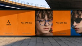
The goal of the new visual identity for eyerim was to change the perception of the company from a fashion eyewear retailer to a professional online optician’s company.
Eyerim was born out of the belief that it is time for glasses to become an area where customers receive the best possible products with quality services at a fair price. Their own “by eyerim“ collections are manufactured to the same high quality as the big brands, but they offer them at much more affordable prices, as they use modern, efficient production and delivery processes. Since 2015, they have made glasses of all kinds more accessible and affordable by focusing their sales around the convenience of their customers – branded, sun, ski, and prescription glasses in one step from the manufacturer directly to customers. In the eyes of the public, however, they were still perceived as just an ordinary retailer of branded glasses.
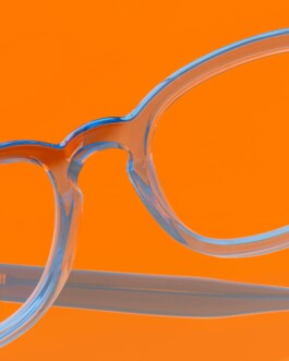
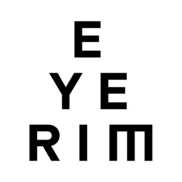
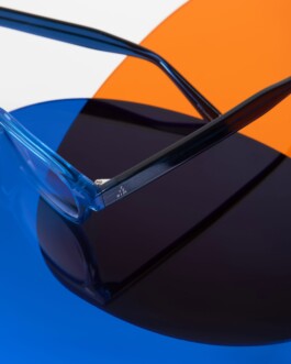
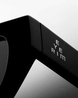
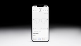
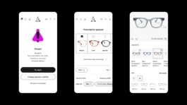
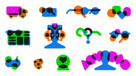
The triangular logo is based on optotypes that are associated with optics – customers read the optotypes from the wall during an eye exam. We placed the logo in a circular shape – a lens, changing according to the type of glasses. We have thus created a large library of different types of lenses that eyerim works with in visual identity applications. We use the natural transparency of the lens in visual identity work – in illustrations, animations, or when filtering photos or architectural elements in the store.
Client: Eyerim
Industry: Retail
Type: Identity, Website, Illustration
Year: 2024


YOU WILL SEE
Eyerim

The goal of the new visual identity for eyerim was to change the perception of the company from a fashion eyewear retailer to a professional online optician’s company.
Eyerim was born out of the belief that it is time for glasses to become an area where customers receive the best possible products with quality services at a fair price. Their own “by eyerim“ collections are manufactured to the same high quality as the big brands, but they offer them at much more affordable prices, as they use modern, efficient production and delivery processes. Since 2015, they have made glasses of all kinds more accessible and affordable by focusing their sales around the convenience of their customers – branded, sun, ski, and prescription glasses in one step from the manufacturer directly to customers. In the eyes of the public, however, they were still perceived as just an ordinary retailer of branded glasses.
The triangular logo is based on optotypes that are associated with optics – customers read the optotypes from the wall during an eye exam. We placed the logo in a circular shape – a lens, changing according to the type of glasses. We have thus created a large library of different types of lenses that eyerim works with in visual identity applications. We use the natural transparency of the lens in visual identity work – in illustrations, animations, or when filtering photos or architectural elements in the store.
Client: Eyerim
Industry: Retail
Type: Identity, Website, Illustration
Year: 2024


Enquiries:
info@andrejandrej.com
(421) 902 118 002
Instagram
Studio:
andrej & andrej s.r.o.
Partizánska 2
811 03 Bratislava
Business ID: 47939206
TAX: 2024156596
VAT ID: SK2024156596
Enquiries:
info@andrejandrej.com
(421) 902 118 002
Instagram