

A Drafting Typography
Isadore

Using the principle of equal energy, pace and space distribution as a metaphor for the new visual identity for a rising star in the cycling apparel peloton.
Isadore is a renowned brand of cycling apparel, created by pro cyclists and athletes. It responds to the previous lack of minimalism, simplicity and sustainability in the cycling apparel market. Since its founding, the brand has amassed a strong and enthusiastic client base, in part due to its activities within the cyclist community. They cater to the lifestyle of cycling which is, in their words, about the joy of the ride and the health benefits of cycling with a focus on care for people and nature.
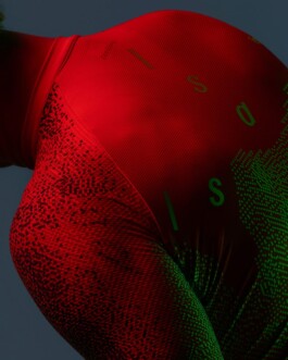
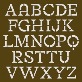
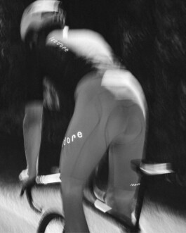
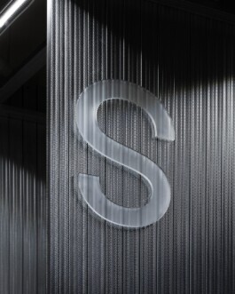
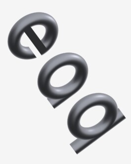
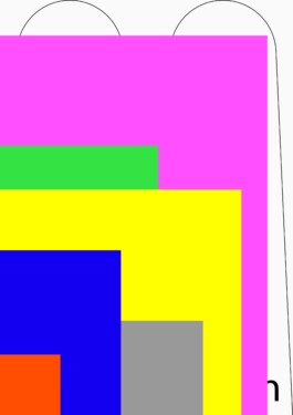
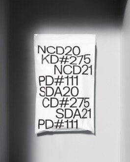
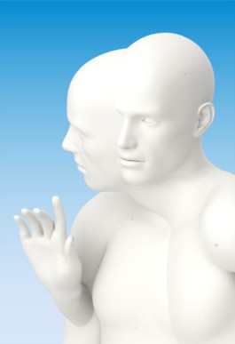
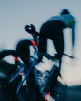
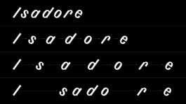
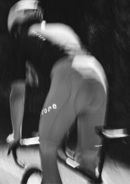
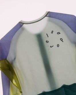
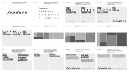
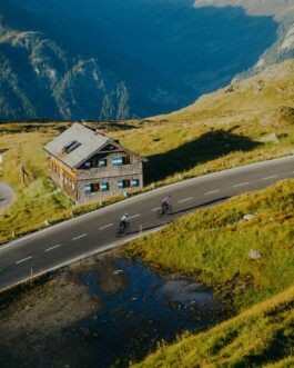
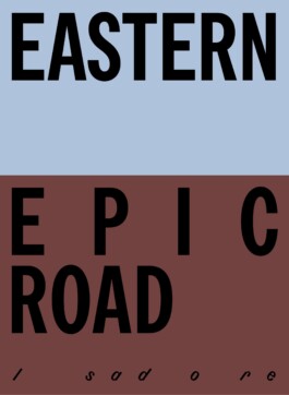
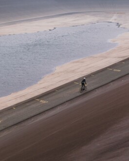
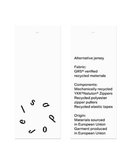
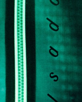
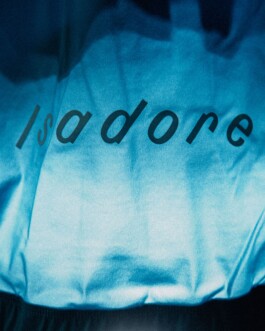
The starting point for Isadore’s new visual identity was their already established logo and its slanted look. Upon the existing logo, a new idea was applied, inspired by the rhythm and speed of cyclists, specifically when riding in the peloton. In order to sustain and save energy, cyclists form the peloton and use “drafting” in which they strive to keep pace with each other and mimic one another's ride by keeping the same spacing. Occasionally, however, some riders break away and disrupt this symbiosis. This principle of equal energy, pace and space distribution was applied as a metaphor to the whole visual identity, whether it comes to the custom characters or the headline typeface. From the technical perspective, the new logotype and its spacing accommodate different stretch fabrics and materials. This system makes the logotype unified when applied to different materials while staying legible even from a distance.
Client: Isadore
Industry: Retail
Type: Identity, Motion
Year: 2023


A DRAFTING TYPOGRAPHY
Isadore

Using the principle of equal energy, pace and space distribution as a metaphor for the new visual identity for a rising star in the cycling apparel peloton.
Isadore is a renowned brand of cycling apparel, created by pro cyclists and athletes. It responds to the previous lack of minimalism, simplicity and sustainability in the cycling apparel market. Since its founding, the brand has amassed a strong and enthusiastic client base, in part due to its activities within the cyclist community. They cater to the lifestyle of cycling which is, in their words, about the joy of the ride and the health benefits of cycling with a focus on care for people and nature.
The starting point for Isadore’s new visual identity was their already established logo and its slanted look. Upon the existing logo, a new idea was applied, inspired by the rhythm and speed of cyclists, specifically when riding in the peloton. In order to sustain and save energy, cyclists form the peloton and use “drafting” in which they strive to keep pace with each other and mimic one another's ride by keeping the same spacing. Occasionally, however, some riders break away and disrupt this symbiosis. This principle of equal energy, pace and space distribution was applied as a metaphor to the whole visual identity, whether it comes to the custom characters or the headline typeface. From the technical perspective, the new logotype and its spacing accommodate different stretch fabrics and materials. This system makes the logotype unified when applied to different materials while staying legible even from a distance.
Client: Isadore
Industry: Retail
Type: Identity, Motion
Year: 2023


Enquiries:
info@andrejandrej.com
(421) 902 118 002
Instagram
Studio:
andrej & andrej s.r.o.
Partizánska 2
811 03 Bratislava
Business ID: 47939206
TAX: 2024156596
VAT ID: SK2024156596
Enquiries:
info@andrejandrej.com
(421) 902 118 002
Instagram