
Local
Timelessness
Som Store

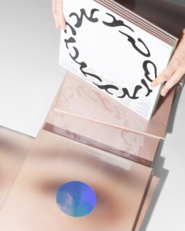
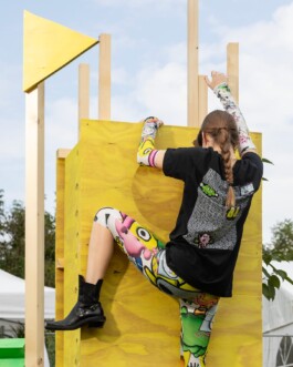
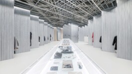
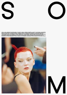
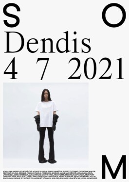
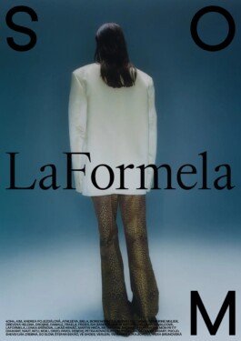
Branding of local fashion concept store from naming to execution. Som Store is a concept store offering the best of the Slovak and Czech fashion scene. Its aim is to make local creations accessible to people who prefer quality, timelessness, tailoring precision, originality and a sustainable approach to work and materials.
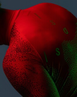
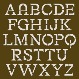
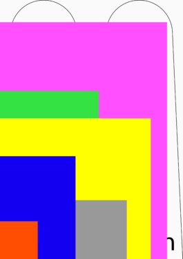
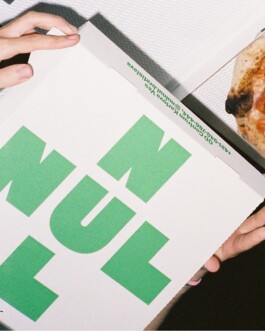
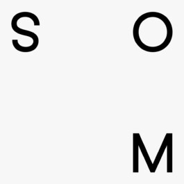
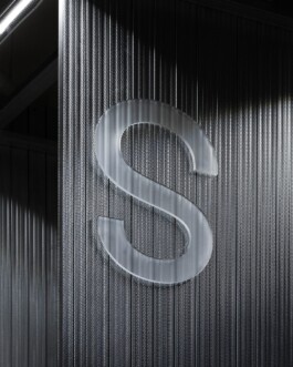
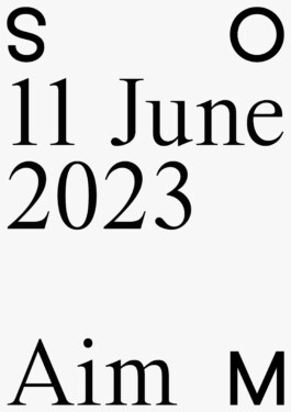
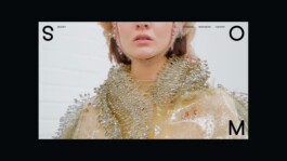
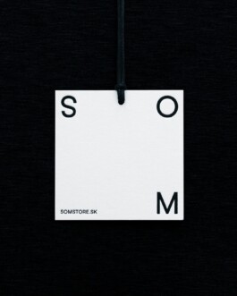
The entire branding process, from the initial naming to the final execution, was meticulously crafted to reflect the store's distinctive identity and mission. SOM Store, named to highlight its core values and vision, serves as a platform for showcasing the finest local fashion talents. At the heart of the brand identity is a versatile design system built around the letters S, O, and M. This system is ingeniously designed to offer a flexible framing mechanism, making the brand immediately recognizable, universally applicable, and user-friendly. The letters S, O, and M are positioned in three corners of the design, creating an open space in the bottom left corner. This space is intentionally left flexible to accommodate either text or image content, allowing for dynamic and diverse applications across various media.
Client: Som Store
Industry: Retail
Type: Identity, Poster
Collaboration: Martin Kahan
Year: 2022


Local Timelessness
Som Store

Branding of local fashion concept store from naming to execution. Som Store is a concept store offering the best of the Slovak and Czech fashion scene. Its aim is to make local creations accessible to people who prefer quality, timelessness, tailoring precision, originality and a sustainable approach to work and materials.
The entire branding process, from the initial naming to the final execution, was meticulously crafted to reflect the store's distinctive identity and mission. SOM Store, named to highlight its core values and vision, serves as a platform for showcasing the finest local fashion talents. At the heart of the brand identity is a versatile design system built around the letters S, O, and M. This system is ingeniously designed to offer a flexible framing mechanism, making the brand immediately recognizable, universally applicable, and user-friendly. The letters S, O, and M are positioned in three corners of the design, creating an open space in the bottom left corner. This space is intentionally left flexible to accommodate either text or image content, allowing for dynamic and diverse applications across various media.
Client: Som Store
Industry: Retail
Type: Identity, Poster
Collaboration: Martin Kahan
Year: 2022


Enquiries:
info@andrejandrej.com
(421) 902 118 002
Instagram
Studio:
andrej & andrej s.r.o.
Partizánska 2
811 03 Bratislava
Business ID: 47939206
TAX: 2024156596
VAT ID: SK2024156596
Enquiries:
info@andrejandrej.com
(421) 902 118 002
Instagram