

Client:
Tatra banka
Industry:
Finance
Type:
Typeface, Logo
Design & Art Direction:
Andrej & Andrej
Typeface production:
Ilja Bažanov
Motion Design:
Lukáš Kollar
A custom typeface and careful evolution of the logo for Tatra banka, one of Slovakia's leading and most innovative banks.
Since 1991, Tatra banka has been identified by its distinctive three-stripe symbol, designed by Slovak graphic designer Dušan Junek. Based on the form of a triangle, the mark references the Tatra Mountains while symbolising growth and progress. The strength and simplicity of the concept have allowed the identity to remain relevant for more than three decades.
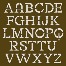
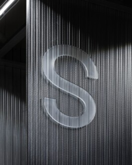
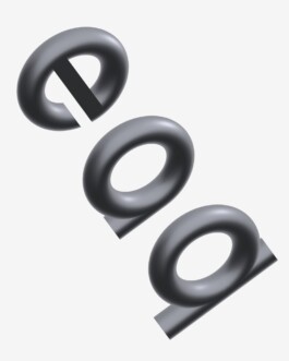
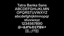
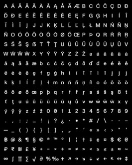
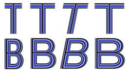
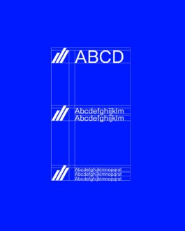
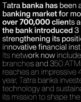
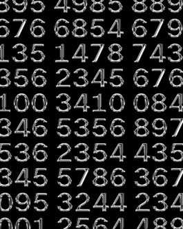
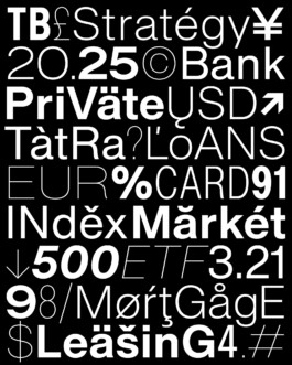
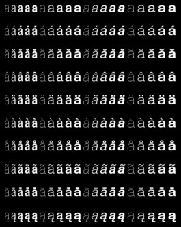
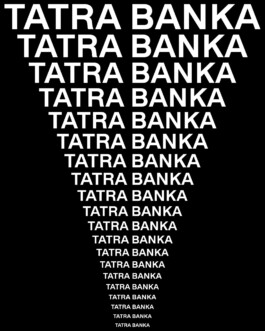
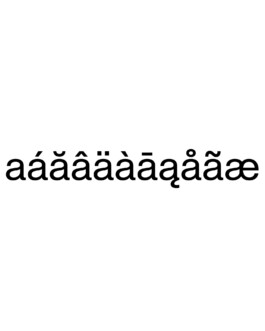
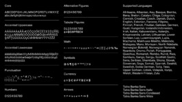
Tatra banka Sans is a neo-grotesque typeface developed specifically for Tatra banka. Rooted in the proportions and discipline of classic neo-grotesques, it brings a contemporary character while preserving clarity and functionality. The family includes Italic, Condensed and Wide styles, extending the system while maintaining a unified typographic voice. The typeface evolved from the custom lettering created for the Tatra banka wordmark, whose proportions, spacing and uppercase construction became the foundation for the complete type family.


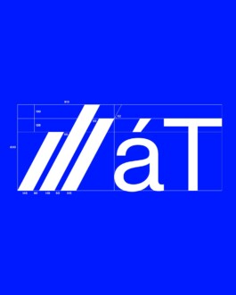
The development of the typeface naturally led to a careful facelift of the logo. Rather than redesigning it, the project focused on subtle optical adjustments to improve its performance across digital and physical applications. The proportions of the three-stripe symbol, the spacing between the bars and their angle were carefully refined to create a single, consistent version. The project also included the development of a unified logo system for business segments, products and subsidiary companies. Shared proportions, hierarchy and construction principles established a coherent framework that ensures consistency across the entire brand ecosystem.


A custom typeface and careful evolution of the logo for Tatra banka, one of Slovakia's leading and most innovative banks.
Since 1991, Tatra banka has been identified by its distinctive three-stripe symbol, designed by Slovak graphic designer and typographer Dušan Junek. Based on the form of a triangle, the mark references the Tatra Mountains while symbolising growth and progress. The strength and simplicity of the concept have allowed the identity to remain relevant for more than three decades.
Tatra banka Sans is a neo-grotesque typeface developed specifically for Tatra banka. Rooted in the proportions and discipline of classic neo-grotesques, it brings a contemporary character while preserving clarity and functionality. The family includes Italic, Condensed and Wide styles, extending the system while maintaining a unified typographic voice. The typeface evolved from the custom lettering created for the Tatra banka wordmark, whose proportions, spacing and uppercase construction became the foundation for the complete type family.
Client: Tatra banka
Industry: Finance
Type: Typeface, Logo
Design & Art Direction: Andrej & Andrej
Typeface production: Ilja Bažanov
Motion Design: Lukáš Kollar


The development of the typeface naturally led to a careful facelift of the logo. Rather than redesigning it, the project focused on subtle optical adjustments to improve its performance across digital and physical applications. The proportions of the three-stripe symbol, the spacing between the bars and their angle were carefully refined to create a single, consistent version. The project also included the development of a unified logo system for business segments, products and subsidiary companies. Shared proportions, hierarchy and construction principles established a coherent framework that ensures consistency across the entire brand ecosystem.


Enquiries:
info@andrejandrej.com
(421) 902 118 002
Instagram
Studio:
andrej & andrej s.r.o.
Partizánska 2
811 03 Bratislava
Business ID: 47939206
TAX: 2024156596
VAT ID: SK2024156596
Enquiries:
info@andrejandrej.com
(421) 902 118 002
Instagram