A taste
of playfulness
Subo

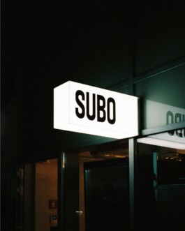
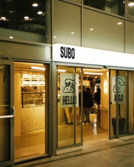
A new artisan bakery at the bus stop on the main crossroads in the centre of Bratislava – the Subo concept was created comprehensively from the name, visual identity, production and communication method.
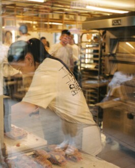
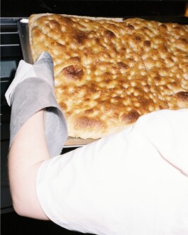
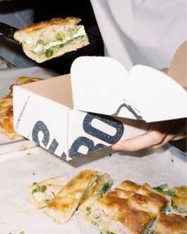
A place where once stood a forgettable fast-food chain spot, now smells of fresh focaccias, summer-at-grandma’s evoking pastry and litres of locally roasted specialty coffee. Subo is not just a bakery though, it’s a comprehensive concept that combines a love of good food, a relentless pursuit of an exceptional customer experience, quality architecture and playful communication. That's why several dozen people have worked to make it a reality, us amongst them!
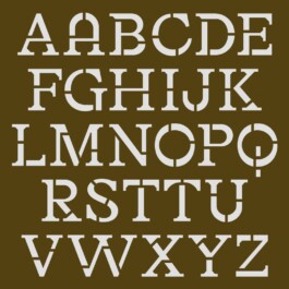
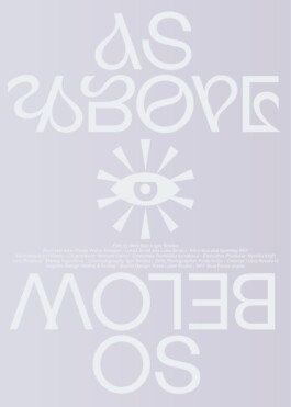
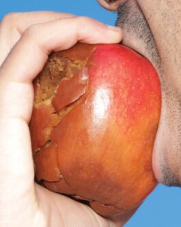
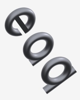
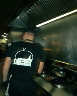
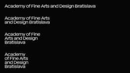
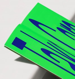
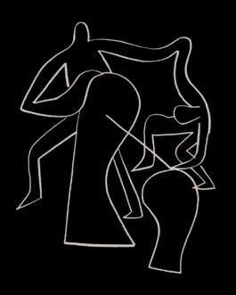
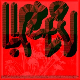
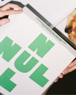
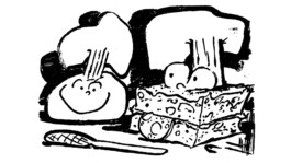
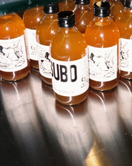
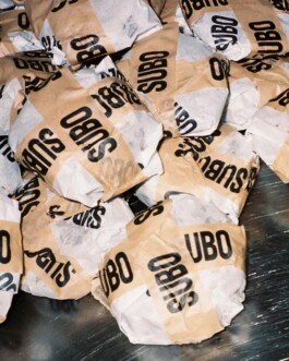
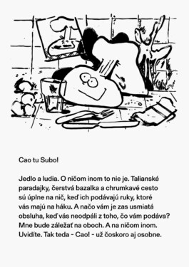
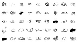
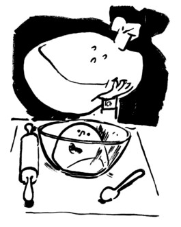
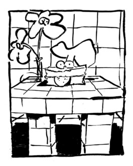
The visual identity is based on the concept of the Subo mascot. The mascot was created from dough, whose basic characteristic is very easy moldability. Therefore, its form is not fixed but changes over time and according to the content it wants to convey. The Bandit font is based on the shapes of wooden plates, which makes it perfectly suited for expressive applications and stamps that we use in our visual identity.
Client: Subo
Industry: Food & Drink
Type: Identity, Naming, Poster, Web
Illustrations: Martin Groch
Naming: Marian Tesák
Architecture: Grau Architects
Year: 2024


A TASTE OF PLAYFULNESS
Subo

A new artisan bakery at the bus stop on the main crossroads in the centre of Bratislava – the Subo concept was created comprehensively from the name, visual identity, production and communication method.
A place where once stood a forgettable fast-food chain spot, now smells of fresh focaccias, summer-at-grandma’s evoking pastry and litres of locally roasted specialty coffee. Subo is not just a bakery though, it’s a comprehensive concept that combines a love of good food, a relentless pursuit of an exceptional customer experience, quality architecture and playful communication. That's why several dozen people have worked to make it a reality, us amongst them!
The visual identity is based on the concept of the Subo mascot. The mascot was created from dough, whose basic characteristic is very easy moldability. Therefore, its form is not fixed but changes over time and according to the content it wants to convey. The Bandit font is based on the shapes of wooden plates, which makes it perfectly suited for expressive applications and stamps that we use in our visual identity.
Client: Subo
Industry: Food & Drink
Type: Identity, Poster, Web
Illustrations: Martin Groch
Architecture: Grau Architects
Year: 2024


Enquiries:
info@andrejandrej.com
(421) 902 118 002
Instagram
Studio:
andrej & andrej s.r.o.
Partizánska 2
811 03 Bratislava
Business ID: 47939206
TAX: 2024156596
VAT ID: SK2024156596
Enquiries:
info@andrejandrej.com
(421) 902 118 002
Instagram